Tuesday, 9 May 2017

Animation


Unit 67: 3D Animation
Task 2


Some scenes are made in Maya and some scenes are made in UE4. The reason behind why I have decided to mix the two together is due to the fact that the scenes which are created in UE4 are also part of my levels whereas the scenes in Maya are scenes which are just created for the animation. The forest scene required some assets which I didn't have time to create such as the trees and the rocks. The trees and rocks are not mine, nor are the images in the background, however I created blocks for the images to be displayed on in the back. Another asset I have used is the flooring, it has slight dips in and the texture is not mine. What is mine in the forest scene is the character, the rigging and the animation. The characters clothes were changed using the UV editor as I originally had a different outfit prepared for the game, whereas I needed something different for the animation to show that it is from the characters past and not the present. Both of the human models textures are both made by me using Photoshop and the UV editor. Using planar and placing the planar in the middle of the model made it super easy for me to texture them as I knew whatever I designed for the left side of the body would also be on the right side of the body. For the face this was extremely fortunate.
The rigged animation was also purposefully made for the forest scene and it took a while to get it to look like she was running. I also moved the trees and rocks in the background across the screen as its own animation to make it look like she was running through the forest and not just on the spot. The camera work for this scene in particular was quite simple, I just needed it to focus on the character instead of anything else and considering the character was technically running on the spot, adding a dynamic shot here and there added some perspective to it all. When it came to the end of the scene I wanted to emphasise what just happened so zooming out slowly only focusing on the character gives the viewer a bit more time to process on what has happened and now what might happen next.
The camera only had a few key frames in whereas when it came to animating the character model, she has quite a few key frames saved. The reason behind this is because of she needed more to create a complex animation whereas the camera only needed to move once or twice and that's it. I also needed to change the placement of a few key frames because it seemed to feel out of sync with the other animation that was playing through in the background.


 Dragging just s few key frames apart and slowing particular parts down really does make a difference. Using the render view really gave me a good insight on what that particular scene would like when its finished. For the scene I have for the clown lady and spotlight, it looks super effective with the black background and white spotlight pointing down. On the other hand, when it came to viewing the forest scene in the render view, it didn't quite turn out to what I wanted it to be. However, changing a few of the settings like using Maya Hardware and Raw/sRGB gamma helped see a better render view of the scene over the original.


There are only a few animation techniques used within this animation such as arcing, slow in and slow out, anticipation and exaggeration; The slow in and slow out technique is used a lot with the virtual camera animations , Zooming in slowly on the focus point and zooming out really adds dramatic effect, Anticipation is used when you see the clown lady bent backwards and she is walking towards you slowly and you can't see her but because the camera is moving towards her, we know that something is about to happen, Arcing is used when it comes to the main character falling over and running and for exaggeration, the clown lady back is bent really far back which exaggerates how far back she can really go.


Overall, I feel as if this animation is lacking in the quality of animation due to animating running for the first time. Although how the environments turned out in Maya, I don't think it turned out too bad. I thought it would be quite difficult to create a forest with only a few assets. Furthermore, I thought it would be quite to rig the models in the first place. When it came to actually designing the scenes, I am quite pleased how they all turned out, in Maya and in UE4. Creating the animation wasn't too bad but making the animation look realistic or to look like she was running was quite difficult. I had the basic movements done, such as; opposite arm to the leg that goes out and adding head movement.On the other hand, just getting it to look realistic took while and I still believe it doesn't look as good as I wished for it to be. Furthermore, the render turn out was also not what I was expecting. 


Unit 71: OO Design


Unit 71: Object Oriented Design for Computer Games


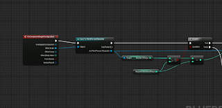
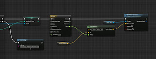
 These three screenshots show the blueprinting which is used for using a certain number of keys to open a door. In this case, the door is a sliding cube which moves upwards once you have collected 3 keys. The 3 keys are little bears which are placed around the map and you are able to run into them and pick them up. So, when the third person character overlaps with the collision box, it will check how many keys that I have. If I have more than or equal to the amount that I have chosen, it will play the timeline. The timeline lasts 3 seconds long. Point A and Point B are the two location points from where it can move to/from. Point B is variable and making it editable allows me to adjust the point when placing the mesh in the game. Further back along the blueprint is a branch. If the player does not have enough keys then it will print a string, in this case it will print text in the top left saying I don't have enough.

 This section is placed within the key blueprint. So starting off with the overlap again, once the player overlaps the collision sphere, I will pick up the key and then it would add to the amount of keys that I currently have. Then once it has been added, it will destroy the mesh so it is not on the ground anymore.


This little section of code was added in, in the ThirdPersonCharacter blueprint. The reason why it was added in was so I could test whether it was added the amount of keys or not and to also test to see whether it will tell me how many keys I currently have on me.


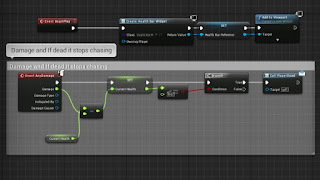
This blueprinting is for applying damage and chasing the player. The reason for the branch and the pawn sensing at the start of the blueprint, is so that it updates that when I have 0 current health and I'd essentially dead he will ignore the sensing updates and continue roaming. The rest is, if the chase is true, then the AI will move and when the AI has moved and came in contact with the third person character, it will apply damage, and the amount of base damage that is dealt is contained within the damage variable. Then there will be a abit of delay before chasing again. The pawn sensing code right at the bottom is just so that the AI only chases me when I'm in the AI's view. The code above was so he was chasing me all the time.

This section is so that the Health Bar displays on the screen, deals the damage and also calls an event dispatcher when the player is dead. When the damage applied from the AI is taken away from the current health, it will display the current health. For example Current health = 100, Damage dealt is 20, Current health = 80 etc. The only time when it won't apply any other damage is if the current health is less than or equal to 0 which then calls the PlayerDead dispatcher.
The PlayerDead event dispatcher is for when the player has reached 0 health and I want the AI to stop chasing me and go back to its roaming.


The middle section of this code is getting the little doll model to follow the pawn in use, which is the third person character. I firstly used a custom event and named it follow me so I could then attach it to AI MoveTo. AI MoveTo contains a few different pins for links to connect to. Connected to the "Pawn" pin is a reference to itself, so the model will move itself in the event and then if it is successful, there will be a delay of a half a second and then it will perform the event.

This last section connects with the pawnsensing on the doll character. The image below is showing what settings I have the pawnsensing on, the reason behind why the sight sensing is so large is due to the fact I want it to keep following my player even if it is not directly in front of it. This code is very simple, so when the third person character is within view of the doll, there is a delay of a second and then it will follow my third person character model.

This blueprint is for loading/going to the next level. The OnActorBeginOverlap event is an event which gets triggered when something overlaps the trigger event. Then I cast to the character that I am using, because I want it to trigger when only the third person character overlaps the trigger box. Then if successful, it will open the level that is typed into that box beneath "Level Name". This blueprint is actually contained within the level blueprint and not an object however it still corresponds with an object, thus being the main character.


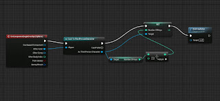
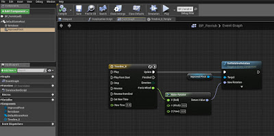
Another small piece of blueprints that work with an object is a blueprint for getting my Ferris Wheel to rotate. This blueprint consisted of using an event graph and a timeline. The timeline is what sets my animation to loop and auto start when I start the game. So as my timeline updates, it will rotate, it refers to the Ferris Wheel head which I have named in in the BP "Improved Ferris". (I had problems with the Center Pivot so I had to go back and re-import an improved model with a centred pivot) Then connecting to the Ferris Wheel node is a "Make Rotator", this makes the rotation in the direction which the link is connected to. I did the same again for the rotating carousel that I have in my first level, except instead of linking the node to the X axis, it worked linking it to the Z axis.


Comparison:

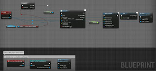
Both engines are different when it comes to OO design. The coding is portrayed differently in both of them. The Unreal Engine uses blueprints for code which is visual code mainly whereas GameMaker uses events which are visual and then lines of code can be written in these events as an action. I prefer doing lines of code instead of the blueprints because, then I understand what all these lines of code are because I'm the one that wrote them out. Whereas using the blueprints, I'm searching for something which I am looking for which can be tedious. However, when it comes to pointing out where something has gone wrong within the blueprinting, its easy as you can just click where the problem is in the compiler results and then it will have red underneath the blueprint. The image below is an example of how it highlights which section of the blueprints is the problem.


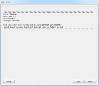
The image below is an example of how GameMaker points out where the error is. It does tell you which piece of code it is and where however, when I close the error window and I open the place of error, I forget which line of code and what the actual problem was. So it's tedious going back to load the game to get the error message to come up again (even though you can copy it, I don't think about that in that moment). Although the fact it points out which line and where the code is, is quite handy.

An example of some of the code that I have created for my space invaders game is below.

Step Event:
if global.bossmoving = 1 then {
if irandom(9) = 1 motion_set(random(360), 1 + random(3))
if irandom(50/global.runthrough) = 1 then {
instance_create(self.x, self.y - 5, obj_bullet)
}
}
How this code works is, if the boss is not following the path anymore then, if 1 is chosen from 0 - 9, the boss has a chance to move in any direction which is chosen randomly from 0 - 360 (in this circumstance would be a full circle) and then the speed is chosen at what rate it moves at by picking a number from 0 to 3. This is some code which is in the boss object, so this is how the movement is linked in with the boss.
The reason why the "1 +" is put in just before it picks a number is so that if the number chosen was 0 then 1 would be added which means it will always be moving and not stationary. The next if statement decides on when the bullet should be fired. If the number 1 is chosen out of 0 to 50 then it creates a bullet. The global.runthrough is a global variable which is used when the player has gone through all the rooms and defeated the boss and it lets the player go through all the rooms again but is harder. Global.runthrough at first would = 1 and then through the second run through it will = 2. With this piece of code above, when it is the second run through of the levels, the boss will have double the amount of chance of firing a bullet than before.
The instance_create section links with the bullet object and all it does is simply creates the bullet on screen with all the pieces of code contained within the obj_bullet.

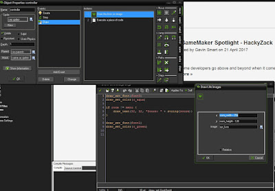
There is a draw event within the controller and what this draw event contains are two actions. These 2 actions within the draw event in the controller, "Draw the lives as image" which displays the amount of lives I want on screen as the spr_lives, "Execute a piece of code" which contains code on the colour of the score font and displays the word "score" in the chosen font. The score and the lives are basically the HUD on the screen for throughout the game. One of these actions displays lines of code and the other action shows visual code. The visual action is the one that works with the sprite I created. I just selected what image I wanted and then I choose what co-ordinates and that is it.


The boss controller object contains the boss health bar which only appears during the boss fight. Below is a screenshot of the code for the boss health bar which is displayed on the screen. However, I can't see what this healthbar looks like on the screen. 


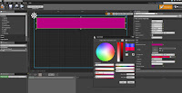
In comparison, UE4 allows me to choose on where to put a progress bar (which would be my health bar) and I also get to change the colour of it there and then in front of me. I prefer being able to visually change the health bar instead of going back, changing the code and then loading up the game again. The first image is just showing the progress bar and the border limit I have, the second image is showing how I can change the colour of it and the size of it.