Wednesday 24 May 2017

Game Production & Evaluation


Game Production and Evaluation

Chosen Brief: 

Above is the brief which I had written before starting to create the game. The final result is different compared to the brief and the reason behind why is due to knowledge of blueprinting and time management. I didn't realise how much time it would take to create a lot of the models that I wanted in my game so I ended up using some pre-made models which were free to download from the Unreal Engine 4 marketplace. I stuck to making the game a stealthy game, however, I scratched out the idea of making the player being able to retaliate and I've decided that it was best if the player was not able to defend themselves at all. I have also added another 2 levels on top of the original three. The first, second and third level are made similar to the concept art I have created and almost fit the description of the brief.
The extra two levels are basically small levels which round off the game nicely. The 4th level is essentially the boss room and you are finally going to escape and the fifth level is a bright, forest level which shows the player they have finally escaped from the Carnival place and they are free. I didn't make any collectables from the brief however, I made candy pieces a pick up for when health is low and I have also made bears as keys to open doors which lead to the next level.
The designs which I had written in the brief are different to what I actually decided. For the clowns I made funky random clothing instead of straight jackets and for the main player they are forced to wear a Harlequin inspired play suit and they also have a rag over their mouth so they cannot speak.


The only thing I have on my HUD now is the health bar. The reason behind why I had just a health bar was because, I had no use for ammo as I made the character unable to retaliate, I didn't make the glass collectables in the end as I made a different source for health and I didn't add a stamina bar because it was a stealthy game and I want the player to take the game slowly and not sprint through.  

My original thought was that I knew that I was going to be adding in extras considering I hadn't used UE4 before in that point of time. I am quite pleased with how all of the levels turned out in the end. I feel as if the changes were for the better. The changes were for a more realistic outcome for the game, I just didn't have the time to create all of the models that I wanted in the game plus I didn't have the time to make all the blueprints that I wanted to create too. However, I am not upset about having to make the changes because it did make it easier for me to complete the game. In fact, because I still had a bit of time, I created those extra levels which made the game longer and made more sense to finish it that way rather than just finish it with the hall of mirrors like intended. 
I thoroughly enjoyed designing the levels and creating the concept art for them. The concept art and Padlet were a huge help in some of the change that have been made. For example, the clown image in the Padlet with no eyes influenced me to create clown models with no eyes, thus making the process easier to make and making it creepy at the same time. Another example is the image of the little doll, the first idea of the doll was to make it sweet and innocent, like the image has portrayed. However, giving the doll no face due to modelling issues, a few began to say the doll looked creepy and this influenced me to actually make the doll a part of a plot twist where the doll was actually following you because she was making sure you reach her in the fourth level. Furthermore, the little bears in which the player picks up are keys to open up the next level, these little bears are the dolls bears. You need enough to please the doll so the door will open.

I didn't make any animations for the models in the game because the running and idle animations were nice enough and I felt no need to remake what has already been made. In the video that I have created showing the game production and the levels show how the rigging of the models have worked with the animations which were created in UE4. In my brief I did not think about the little things such as loading screen design and particle effects. They were things that were added in just for aesthetic reasons. 

What I liked from the first level was the carnival environment that I created. The balloons, the stands, the carousel, the wheel and the tent really help lighten up the environment considering it is dark and gloomy. The second level I believe turned out greatly, even though the inside of the tent was huge, I am glad I was able to fill the areas and make it look interesting. The layout of the objects in the center ring is purposefully done, adding a little mini game in there for the player is just to add a little bit of fun into the game. The third level is probably one of the most interesting yet easiest levels to make. All I had to do was copy and paste the mirrors over and over again and put them into place to create a maze. What I particularly loved about the third level was the lighting in the never changing environment. The fourth level was just a quick level that I made. The grass and the greenery in the first little bit was influenced by the animation scene in the forest and then the room after was just a theme of red. The dark red colours portrays danger and evil so this was fitting for the "boss room". The floating platforms is what makes it interesting as this was an idea on how to escape the boss instead of fighting it.

The final level was an idea that was influenced from the animation that I had made. The first scene of the animation was the main character seen running through a forest to get away from something. I thought about making the forest scene into a level. This is the design for the final level. I did not plan this level, it was added in at the end, potentially as a filler and just a nice way to end the game. The objects move so the player can have some enjoyment when it comes to standing on them or just messing around with them.


Above is the link to the video for my Game Production & Evaluation.

Music Used in the game: 


Tuesday 9 May 2017

Animation


Unit 67: 3D Animation
Task 2


Some scenes are made in Maya and some scenes are made in UE4. The reason behind why I have decided to mix the two together is due to the fact that the scenes which are created in UE4 are also part of my levels whereas the scenes in Maya are scenes which are just created for the animation. The forest scene required some assets which I didn't have time to create such as the trees and the rocks. The trees and rocks are not mine, nor are the images in the background, however I created blocks for the images to be displayed on in the back. Another asset I have used is the flooring, it has slight dips in and the texture is not mine. What is mine in the forest scene is the character, the rigging and the animation. The characters clothes were changed using the UV editor as I originally had a different outfit prepared for the game, whereas I needed something different for the animation to show that it is from the characters past and not the present. Both of the human models textures are both made by me using Photoshop and the UV editor. Using planar and placing the planar in the middle of the model made it super easy for me to texture them as I knew whatever I designed for the left side of the body would also be on the right side of the body. For the face this was extremely fortunate.
The rigged animation was also purposefully made for the forest scene and it took a while to get it to look like she was running. I also moved the trees and rocks in the background across the screen as its own animation to make it look like she was running through the forest and not just on the spot. The camera work for this scene in particular was quite simple, I just needed it to focus on the character instead of anything else and considering the character was technically running on the spot, adding a dynamic shot here and there added some perspective to it all. When it came to the end of the scene I wanted to emphasise what just happened so zooming out slowly only focusing on the character gives the viewer a bit more time to process on what has happened and now what might happen next.
The camera only had a few key frames in whereas when it came to animating the character model, she has quite a few key frames saved. The reason behind this is because of she needed more to create a complex animation whereas the camera only needed to move once or twice and that's it. I also needed to change the placement of a few key frames because it seemed to feel out of sync with the other animation that was playing through in the background.


 Dragging just s few key frames apart and slowing particular parts down really does make a difference. Using the render view really gave me a good insight on what that particular scene would like when its finished. For the scene I have for the clown lady and spotlight, it looks super effective with the black background and white spotlight pointing down. On the other hand, when it came to viewing the forest scene in the render view, it didn't quite turn out to what I wanted it to be. However, changing a few of the settings like using Maya Hardware and Raw/sRGB gamma helped see a better render view of the scene over the original.


There are only a few animation techniques used within this animation such as arcing, slow in and slow out, anticipation and exaggeration; The slow in and slow out technique is used a lot with the virtual camera animations , Zooming in slowly on the focus point and zooming out really adds dramatic effect, Anticipation is used when you see the clown lady bent backwards and she is walking towards you slowly and you can't see her but because the camera is moving towards her, we know that something is about to happen, Arcing is used when it comes to the main character falling over and running and for exaggeration, the clown lady back is bent really far back which exaggerates how far back she can really go.


Overall, I feel as if this animation is lacking in the quality of animation due to animating running for the first time. Although how the environments turned out in Maya, I don't think it turned out too bad. I thought it would be quite difficult to create a forest with only a few assets. Furthermore, I thought it would be quite to rig the models in the first place. When it came to actually designing the scenes, I am quite pleased how they all turned out, in Maya and in UE4. Creating the animation wasn't too bad but making the animation look realistic or to look like she was running was quite difficult. I had the basic movements done, such as; opposite arm to the leg that goes out and adding head movement.On the other hand, just getting it to look realistic took while and I still believe it doesn't look as good as I wished for it to be. Furthermore, the render turn out was also not what I was expecting. 


Unit 71: OO Design


Unit 71: Object Oriented Design for Computer Games


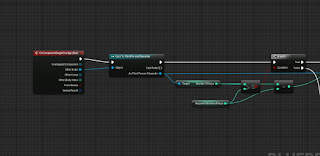
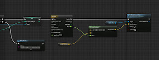
 These three screenshots show the blueprinting which is used for using a certain number of keys to open a door. In this case, the door is a sliding cube which moves upwards once you have collected 3 keys. The 3 keys are little bears which are placed around the map and you are able to run into them and pick them up. So, when the third person character overlaps with the collision box, it will check how many keys that I have. If I have more than or equal to the amount that I have chosen, it will play the timeline. The timeline lasts 3 seconds long. Point A and Point B are the two location points from where it can move to/from. Point B is variable and making it editable allows me to adjust the point when placing the mesh in the game. Further back along the blueprint is a branch. If the player does not have enough keys then it will print a string, in this case it will print text in the top left saying I don't have enough.

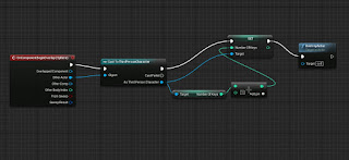
 This section is placed within the key blueprint. So starting off with the overlap again, once the player overlaps the collision sphere, I will pick up the key and then it would add to the amount of keys that I currently have. Then once it has been added, it will destroy the mesh so it is not on the ground anymore.


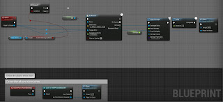
This little section of code was added in, in the ThirdPersonCharacter blueprint. The reason why it was added in was so I could test whether it was added the amount of keys or not and to also test to see whether it will tell me how many keys I currently have on me.


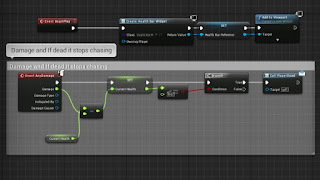
This blueprinting is for applying damage and chasing the player. The reason for the branch and the pawn sensing at the start of the blueprint, is so that it updates that when I have 0 current health and I'd essentially dead he will ignore the sensing updates and continue roaming. The rest is, if the chase is true, then the AI will move and when the AI has moved and came in contact with the third person character, it will apply damage, and the amount of base damage that is dealt is contained within the damage variable. Then there will be a abit of delay before chasing again. The pawn sensing code right at the bottom is just so that the AI only chases me when I'm in the AI's view. The code above was so he was chasing me all the time.

This section is so that the Health Bar displays on the screen, deals the damage and also calls an event dispatcher when the player is dead. When the damage applied from the AI is taken away from the current health, it will display the current health. For example Current health = 100, Damage dealt is 20, Current health = 80 etc. The only time when it won't apply any other damage is if the current health is less than or equal to 0 which then calls the PlayerDead dispatcher.
The PlayerDead event dispatcher is for when the player has reached 0 health and I want the AI to stop chasing me and go back to its roaming.


The middle section of this code is getting the little doll model to follow the pawn in use, which is the third person character. I firstly used a custom event and named it follow me so I could then attach it to AI MoveTo. AI MoveTo contains a few different pins for links to connect to. Connected to the "Pawn" pin is a reference to itself, so the model will move itself in the event and then if it is successful, there will be a delay of a half a second and then it will perform the event.

This last section connects with the pawnsensing on the doll character. The image below is showing what settings I have the pawnsensing on, the reason behind why the sight sensing is so large is due to the fact I want it to keep following my player even if it is not directly in front of it. This code is very simple, so when the third person character is within view of the doll, there is a delay of a second and then it will follow my third person character model.

This blueprint is for loading/going to the next level. The OnActorBeginOverlap event is an event which gets triggered when something overlaps the trigger event. Then I cast to the character that I am using, because I want it to trigger when only the third person character overlaps the trigger box. Then if successful, it will open the level that is typed into that box beneath "Level Name". This blueprint is actually contained within the level blueprint and not an object however it still corresponds with an object, thus being the main character.


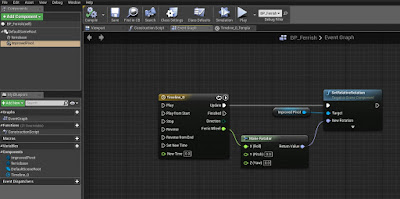
Another small piece of blueprints that work with an object is a blueprint for getting my Ferris Wheel to rotate. This blueprint consisted of using an event graph and a timeline. The timeline is what sets my animation to loop and auto start when I start the game. So as my timeline updates, it will rotate, it refers to the Ferris Wheel head which I have named in in the BP "Improved Ferris". (I had problems with the Center Pivot so I had to go back and re-import an improved model with a centred pivot) Then connecting to the Ferris Wheel node is a "Make Rotator", this makes the rotation in the direction which the link is connected to. I did the same again for the rotating carousel that I have in my first level, except instead of linking the node to the X axis, it worked linking it to the Z axis.


Comparison:

Both engines are different when it comes to OO design. The coding is portrayed differently in both of them. The Unreal Engine uses blueprints for code which is visual code mainly whereas GameMaker uses events which are visual and then lines of code can be written in these events as an action. I prefer doing lines of code instead of the blueprints because, then I understand what all these lines of code are because I'm the one that wrote them out. Whereas using the blueprints, I'm searching for something which I am looking for which can be tedious. However, when it comes to pointing out where something has gone wrong within the blueprinting, its easy as you can just click where the problem is in the compiler results and then it will have red underneath the blueprint. The image below is an example of how it highlights which section of the blueprints is the problem.


The image below is an example of how GameMaker points out where the error is. It does tell you which piece of code it is and where however, when I close the error window and I open the place of error, I forget which line of code and what the actual problem was. So it's tedious going back to load the game to get the error message to come up again (even though you can copy it, I don't think about that in that moment). Although the fact it points out which line and where the code is, is quite handy.

An example of some of the code that I have created for my space invaders game is below.

Step Event:
if global.bossmoving = 1 then {
if irandom(9) = 1 motion_set(random(360), 1 + random(3))
if irandom(50/global.runthrough) = 1 then {
instance_create(self.x, self.y - 5, obj_bullet)
}
}
How this code works is, if the boss is not following the path anymore then, if 1 is chosen from 0 - 9, the boss has a chance to move in any direction which is chosen randomly from 0 - 360 (in this circumstance would be a full circle) and then the speed is chosen at what rate it moves at by picking a number from 0 to 3. This is some code which is in the boss object, so this is how the movement is linked in with the boss.
The reason why the "1 +" is put in just before it picks a number is so that if the number chosen was 0 then 1 would be added which means it will always be moving and not stationary. The next if statement decides on when the bullet should be fired. If the number 1 is chosen out of 0 to 50 then it creates a bullet. The global.runthrough is a global variable which is used when the player has gone through all the rooms and defeated the boss and it lets the player go through all the rooms again but is harder. Global.runthrough at first would = 1 and then through the second run through it will = 2. With this piece of code above, when it is the second run through of the levels, the boss will have double the amount of chance of firing a bullet than before.
The instance_create section links with the bullet object and all it does is simply creates the bullet on screen with all the pieces of code contained within the obj_bullet.

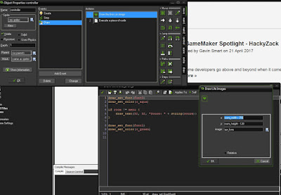
There is a draw event within the controller and what this draw event contains are two actions. These 2 actions within the draw event in the controller, "Draw the lives as image" which displays the amount of lives I want on screen as the spr_lives, "Execute a piece of code" which contains code on the colour of the score font and displays the word "score" in the chosen font. The score and the lives are basically the HUD on the screen for throughout the game. One of these actions displays lines of code and the other action shows visual code. The visual action is the one that works with the sprite I created. I just selected what image I wanted and then I choose what co-ordinates and that is it.


The boss controller object contains the boss health bar which only appears during the boss fight. Below is a screenshot of the code for the boss health bar which is displayed on the screen. However, I can't see what this healthbar looks like on the screen. 


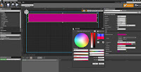
In comparison, UE4 allows me to choose on where to put a progress bar (which would be my health bar) and I also get to change the colour of it there and then in front of me. I prefer being able to visually change the health bar instead of going back, changing the code and then loading up the game again. The first image is just showing the progress bar and the border limit I have, the second image is showing how I can change the colour of it and the size of it.


Tuesday 28 March 2017

Storyboard Brief:

This cut scene will be used as an intro to the game as it links with the beginning of the game. It starts off creepy, however this creepy beginning is only a dream she is having. The next scene of her laying the forest in the day adds a sense of mystery as to why is she there? Why was she sleeping? Is she alone? Was she there on purpose or put there by someone? When she wakes up, she shrugs it off and starts heading off into the forest. However...she begins to hear the music and giggling which was in her dream and she sees an old circus tent. In a panic of the music and giggle getting louder, she runs away looking behind her. Looking behind her was a mistake as she then trips up on a tree root and knocks herself out by hitting her head on a rock. Hours later...she regains consciousness and notices she is being dragged by something/someone through the forest, it begins to snow and get darker, she then fades into an unconscious state and the scene ends. As the cut scene is quite creepy and falls under the theme of thriller/horror, the intended audience is for 16+. Below is my Padlet page that I have created. Contained on this page is a group of images which is inspiration for my game and concept art. There are few images which inspired my created concept art and scenes for the trailer. For example, the first scene (which is also the 3rd level in the game) is hall of mirrors themed, however it some of the torn curtains from the interior of the tent section is what I thought would look effective in the house of mirrors. Combining the two ideas was stimulated from the two different images on my Padlet.


https://padlet.com/wall/474zsva3c91u

Part 1+2: Pans through the maze of mirrors with some music playing and then it goes dark…. The creepy clown girl bent over backwards starts walking towards the camera, giggling and then when it pops up, the screen goes black. The lighting for this section will be, a spotlight will highlight the creepy clown girl so that it really emphasises shes there and you're not sure what else is lurking in the dark.
Part 3+4+5: It then changes scene to the girl laying down in the woods, she walks off into the trees and then hears the giggle and the music from the dream getting louder and louder. She runs off, trips and knocks herself out. The lighting for this section will be light, as if it was day time. The sun (the light source) will be shining from the left so the shadows are to the right. The reason for this so that when she is walking into the light, it creates a feeling of safety however, when she starts to run away, she is running into the shadows which completely contrasts the feeling of safety.
Part 6: The screen goes black again and then slowly fades into view, the camera angle is a first person angle of her being dragged away… the screen then fades to black again. This scene will be at night time so it matches the time of the game. 


The image above is the concept art for a level/environment which I had made in Photoshop. This level will be the first scene of the animation sequence and is the first chapter of the story board. I particularly chose the hall of mirrors to be the first scene because it would be the last place the player recognises, and because they recognise the place, they will be expecting a few surprises, possibly, as the dream doesn't show you much more of the place except for the clown with the back bent backwards. Furthermore, this may get them to act more cautious and I believe that this place is quite atmospheric, even if it does only have 1 object in.


This is some of the concept art for the one of the clown designs. What I have decided to take from this concept art is the stripes on the clown and how broken the clown actually is. However, I took a different approach to how I actually wanted the creepy clown to be like, I wanted the stance to be different altogether to make it even more creepy and I changed what the clown wore just for aesthetic reasons.

I’ve took into consideration how long each scene will take and what camera view it will be viewed in. Planning through how long each scene will be helps me define when I should switch scenes and how long I should spend on them. Furthermore, deciding on the camera views whilst drawing out the story board really helps me visualise how the scenes would turn out and helps me decide quicker on how much I scenery I really need to cover that particular scene. So for example, with the birds eye view of the forest, all of the assets that I would need for that scene are trees and grass, because, that’s all that would come into view.


The timeline in which I have created is used to keep track and a schedule of what is it supposed to be finished and when it needs to be finished by. The timeline consists of 10 milestones which is quite easy going and they are all spread out over the length of time I have until the hand in date. I used Excel to create this and I believe this is a great way for me to see clearly what milestones I need to complete by when. The reason behind why the dates are not exactly lined up with the dates is due to the fact that I would prefer to get them done a bit earlier than what they should be. For example, I've said that I want the rigging to be finished for the 11th of April. However, I technically have until the 13th of April as that is the date that is clearly displayed. Giving myself the leniency of the two days just in case it takes me longer than I had planned. If I hover over the red milestones points, it tells me the date in which I have chosen to complete them by/start the milestones.

Needs:Trees
Female Character
Grass
Lighting
Creepy Clown
A chosen music track
A giggle sound
A video of the camera panning the 3rd level (The hall of mirrors maze)
Use of Maya
Use of Adobe Premiere
Use of Excel


Unit 6: Task 2

Task 2

Dark Souls 3 is an action, RPG game in a league of its own. This game is very difficult and the lore behind the characters is very rich indeed and I believe this is what interests the players the most in the game. The content within the game tends to stick to the medieval, dark ages side of things. The use of swords and shields instead of guns and bullet proof vests, gauntlets and helmets instead of night vision and tech. The choice in content is pretty fluent throughout the game and everything is pretty much in the old ages of time. Where areas were lit up with candles and torches and buildings were decorated with paintings and curtains. The game heavily depends on faith and sorcery throughout which adds onto the fantasy side of things. On the other hand, another game which is quite similar to this game but uses different content is Bloodborne. Bloodborne is a Souls like game which fits the theme of Gothic Novels so to say. The environments are dark and the architecture is heavily inspired from Gothic decor. The image below is from Bloodborne, and to strengthen my view on the Gothic decor, you can see the designs of the lanterns and the fences to be similar to the 18th Century style.


The graphics in the game are quite intense, the detail on just the smallest of objects are defined and the environments are breathtaking. One of my favourite areas to spend time in is the Irithyll of Boreal Valley. The image below is a picture of Irithyll of Boreal Valley and it shows the sheer amount of detail that is contained within this area which supports my comment of saying the graphics are intense.


Where this environment is placed within the game is very rewarding to say the least. The area before this place is the Catacombs of Carthus. The Catacombs of Carthus is an underground area which you have to travel through and defeat the boss are to reach the Irithyll of Boreal Valley. The reason behind why I feel like the view you are presented with when you first see Irithyll of Boreal Valley is rewarding is due to the feeling, it genuinely feels like a breath of fresh air when you get outside of the Catacombs. Furthermore, the soft tones of blue and the night sky really make the environment look beautiful which compares to the environment of the Catacombs, dark tones, dusty and dirty. You can also see below, that the bones and the bricks are detailed in the catacombs, even though these are just object that the player would glance over whilst running through the area.


Music within this game plays a big part for the bosses. Each individual boss has their own unique music that plays in the background of the music. My absolute favourite boss music has to be the Dancer of Boreal Valley. The music which was composed for this boss fight suits the character and the fight so well. The music is just quiet enough at the beginning that they have amplified the dancers footsteps to create and build up a tense atmosphere ready for the fight. When you get the dancer to go into her second phase, the music intensifies and it does for most of the bosses throughout the game. The music is quite graceful and well composed, it correlates with her name and the way she handles the swords, she essentially "dances" with them further into the fight. Furthermore, when you receive her swords, you are able to perform the Dancer's Grace weapon art which allows you to "dance" with the swords too.

                                   https://www.youtube.com/watch?v=jZ21JRZKSK4


Another boss fight which has great music and sound effects is Oceiros the consumed king boss fight. Before entering this boss fight, you can hear wailing noises coming from the fog wall in front of you. These distressing noises make the player begin to feel a little weary on what lies ahead of them in that room. When the cut-scene is finished, you will hear a baby crying but yet, see no baby in the room. These sound effects can make the player feel uncomfortable or a little distressed due to the sound effects. The music which is played in the boss fight changes once you reach his second phase. The pace of the music changes when the boss changes.


There are carvings in the game which you can drop on the floor and it will play a voice. These objects are quite fun to use and is a great way to communicate with others players if you do not have a microphone or want to use a microphone. The sound effects which are made from these are quite amusing and I believe is a great way to lighten up the game, considering it is very difficult. There are 5 carvings altogether and the tone of the voice is the same however it is quite amusing to listen to.


Within the Dark Souls' games, the story isn't as easy to figure out as other games. The main objective of the game is to find and return the five Lords of Cinder to the thrones which are in the Firelink Shrine so that you can link the flame again. You are known as "unkindled". Unkindled means you are considered to be less of a being than an Undead. The five Lords of Cinder that you are set out to seek are Ludelth the Exiled, Aldrich, Saint of the Deep; Holy King Lothric (Twin Brothers), Abyss Watchers (Farron's Undead  Legion) and Yhorm the Giant. Each of the Lord of Cinder have their own lore to them which is speculated by fans,the evidence they base their view of the back story from is from snippets of spoken quotes which characters in the game speak. What I particularly like about how the story is implemented into the game is that, it is left to the players to interpret the story in many different ways. Looking through the armour descriptions and the object descriptions, it allows the players to determine the story behind certain characters, the aid of the descriptions and quotes is really what makes the story of the characters and the main narrative overall interesting.
The characters themselves are represented in different ways. The Lords of Cinder are represented in two different ways, 4 of the Lords of Cinder are bosses within the game and are placed in throughout the areas. The areas in which they are placed are areas in which they essentially "control". For example, the Profaned Capital is the place where the player fights Yhorm the Giant. The lore behind this place is that the Profaned Capital was the only place where a giant ruled over the humans and this giant was Yhorm. The only Lord of Cinder which is not a boss is Ludeth. He is already sat upon his throne in the Firelink shrine and you can interact with him to transpose boss souls (souls which are given to you after defeating a boss). At first, the bosses are portrayed quite negatively, as soon as you enter their room, they immediately try to kill you. However, when it comes down to it, they are just fulfilling their duty and once you have defeated them, you return them to their thrones in cinders.
You have to travel through areas to reach each Lord of Cinder and then you have to defeat them to get the ending. There are 4 different endings and how you get these 4 different story endings is by completing certain characters quest lines whilst travelling through all the areas and defeating all of the bosses.


The females within this game, I believe, are not stereotypical. Usually in games, the female features are exaggerated however, the females in this game, their features are not exaggerated. Furthermore, the females are not all stuck wearing skirts or dresses, they are also seen in armour. There is a character within the game which is the opposite gender dependent on which gender you chose for your character. This character is called Anri. With the character design, it does not accentuate on features at all, the only way for you to tell the difference between whether it is a female or male is the voice. Another female is Sister Friede. Her features are not exaggerated like they typically are in a few other games and what she wears supports where she is placed and her name. She wears the ordained set and ordained means to make someone a priest or minister. Yuria of Londor is another female within the game, she merges the two ideas together, she wears armour however she also keeps the feminine touch with the dress. However, there is meaning behind the dress. The black dress is worn to resemble a mourning dress. The images below are the characters that I have mentioned. The far left is Anri, the far right is Yuria and the image at the bottom is Sister Friede. Yuria and Sister Friede are actually sisters. We find out this information from a quote Yuria speaks.

"Ahh, our Lord and Liege.Twas the soul of my sister.
Elfriede...A poor wench turned to Ash, who would abandon Londor...
If thou wouldst, let it nourish they Lordship.
And in return, do her one small kindness.
Remember those who stayed by her to the end, in the shadows cast by fire...
And lastly, my Lord, take up thy rightful mantle, of usurper."


The fact that the story is quite open to the audience to interpret, I believe that this game was intended for teens/young adults to enjoy, the game is rated 16. Furthermore, due to the complex builds you create and the difficulty of the game, it strengthens my point on why I believe the game was intended for young adults. The system would just be too complex for children to enjoy, also the blood and enemies are too graphic for children to endure. The fact that the game is complex and difficult was something that was expected in this 3rd sequel of the game. What else was expected was a few similar features to DS1 (Dark Souls). Considering this was the 3rd and final game of the Dark Souls series, the expectations were pretty high. A lot of people were demanding certain features to come back considering a few features were missed out in Dark Souls 2. Furthermore, the Dark Souls series is quite a unique series so deciding that number 3 would be the final Dark Souls leave even higher expectations to make it the best it could possibly be. The expectations I had for the DLC were pretty high until they delivered it, then I was disappointed. What I had expected from the DLC was more bosses to fight, a few more areas to covers and lots of new lore to speculate. However, the DLC was short lived, it did tie up a few loose ends within the mountains of lore however, it was very short and only contained 2 bosses. The next DLC is out fairly soon and the expectations for this DLC is quite high. Lots are expecting that this last DLC should finally sum up the story of Dark Souls altogether as this the last DLC for the last instalment of Dark Souls. It is also expected to be longer than the previous DLC and contain more bosses, NPCs and armour.

The Dark Souls series is a unique game in its genre category. The games genre is Action-RPG, and the the typical action-RPG games are The Elder Scrolls series, The Witcher series, Diablo series and more. The character you play in this game, is completely your choice. You choose your appearance, you choose how far apart you would like your eyes, how big you want your nose, the colour of skin and so much more. This already is a difference compared to the other series mentioned.


The Souls series welcomed a new spin-off to the ARPG genre. What this introduced was high difficulty for the players, ridiculously hard enemies to defeat, and not a linear story line. This series is quite punishing to players that die as you only have one chance to regain what you have earned IF you can reach your souls without dying a second time. Furthermore, in The Elder Scrolls series and other games alike this, they have quests in which you complete for rewards and to progress whereas, with the Souls series, there are quests BUT you have to figure out how they configure together. So the NPCS which are scattered about the game, all have their own quests for the player to complete, without actually giving them much detail on how to complete it.  


Tuesday 21 February 2017

Unit 6: Critical Approaches to Creative Media Products

Task 1: 

There are a few different theories behind the effects of violent video games on the audience. The media has produced lots of different points and opinions on how violent video games affect the audiences they are made for and also affect the audiences that they were not originally intended for, 11 out of 18 people on the survey we conducted as group, had starting playing 18+ rated games before they were 13. The intended audiences are for those who are 18 or over and with over 50% of people who took the survey played 18 games before they were 18 is possibly what led to all the controversy with violence in video games. The hypodermic needle model theory was created by the media due to a "Manhunt murder" which was committed by a 17 year old. The game which allergdly lead him to do this was Manhunt which is rated 18+. Even being one year younger still left him underaged to play this game.
http://www.dailymail.co.uk/news/article-316491/Teenager-gets-life-Manhunt-murder.html

Hypodermic needle model is also known as the hypodermic-syringe model or transmission-belt model or magic bullet theory. Now the reason behind why it is also known as these names is due to the description of the term. A needle is known for injecting something into someone, this model is basically injecting a suggested, intended message into the receiver and the receiver accepts this. Relating to violence within video games, the intended message could possibly be that the game is displaying violence is okay because it is accepted within the game. This links in with passive consumption which is where the player just goes along with whatever the game delivers and continue to play without even question what is going on. Most of the responses to video games in general are active consumption responses. Active consumption is where a player questions a lot of what is going on, why this happening within the game, why something has happened and questions what the game is portraying.

When watching some you tubers, they tend to elaborate on what is going on in the game and question what is going on. Many YouTubers/Gamers in general have different responses from what they take in from a game. Preferred responses are more aimed to the passive consumption side of things as the player just understands the message and agrees with it, no questioning, just accepting it and carrying on with the game. Oppositional responses are responses where the gamer begins to question what is happening within the game and they choose to reject the theory at hand and has an alternate view about it. Negotiated responses are responses where you agree with what the game is going along with and what they are showing them however, they may potentially change what the game is trying to say so it suits their own experiences/interests. Negotiated responses effectively partners with the uses and gratification theory.  Uses and Gratification theory is a theory based on the how the audience consumes what is placed before them, how they interpret the media and that they are responsible for how they interpret it. Furthermore, the audiences also are responsible for the media they've chose which fulfils their need. There are four different models which are suggested to fulfil audiences need when we chose that particular media. These four models are Identity, educate, entertain and social interaction. Relating this to games, many people choose to play certain games as it being a way to get away from reality, a way to have fun doing what we want to do, be someone else for a change, to just learn a few things, to compete against others and to possible challenge themselves. However, this saying that we are responsible for what media we choose to indulge ourselves in is criticised by others as many say that "the public has no control over the media and what it produces - do not need to take responsibility for what they produce". http://www.slideshare.net/zlorhenley/uses-and-gratifications-theory-6933502

An advertisement which was made a while back, used reactions to gain interest from the audience. I would agree with the statement that we are responsible for what we indulge in, if we never chosen to become interested in this media exploit then it would of not became so popular. Furthermore, it may fulfil the needs of some rebellious children who in which, like the idea of watching their mother become horrified due to this gory, action full game, it goes against what a mother would recommend which some teens are drawn towards. The Advert I am talking about is"Your Mom Hates Dead Space 2" advert, where they use the idea of where they use negative reactions as a selling point. From a personal view, the fact that these Mums find this game horrifying and disgusting would make rebellious teens want to play and buy the game. However, many others find this way of advertisement falling into the negative region because of the way it was approached. Below are a few of the comments from the YouTube video. They are mixed reviews on the way that this had been advertised.

"If moms hate it then you know it's a good game"
"Hunh, aren't Moms the ones buying this game for their 'rebellious' teenagers? Can't wait for the "Your Dad Hates Dead Space 2" ads to come out. Using stereotypes like this makes the brand feel less edgy, kinda sexist and dated- that's probably counter to what they are trying to achieve"
"This advert is very interesting. What market segment are they targeting with it? The "over 18's who care what their mum thinks" market? Does such a market exist? Of course not. This advert is targeted at children too young to legally play the game. Shame on you"
"ESRB is just a guideline. It's just there to recommend their thoughts on the age suitability of the game." (In reply to the comment above)
https://www.youtube.com/watch?v=nKkPFDEiC6Q

There has always been debates on violent video games, whether they should be banned, whether they should be censored, whether the age restriction should be higher and so on. This is all due to the effects is has on the gamers. As a group we conducted a survey and one of the questions were "Do you think that violent video games affect your mentality when playing other types of games?" and 9 out of 20 said, being exposed to violent content does affect their mentality when it comes to playing games that do not contain violent scenes within them. For example, if you play a game like Dark Souls 3 where you can kill the NPC's and then switch to a game like Stardew Valley where you cannot kill NPC's, some may think that it may be possible to kill them and try it whereas others may just not even have that thought and the play the game casually. This could link in with a few health concerns because of the behaviour that we have chosen to indulge in is the one where we change our thought pattern within games and then possibly it may affect our thought pattern and behaviour within reality.
They are a few health concerns which are related to video games in general. However, the negative health conditions can come from violent video games whereas the positive health care are related to all games in general. Some say that violent video games can influence their behaviour and reactions within the real world, and the reason behind why they are possibly worse than TV or Movies is due to the fact it is the players choice to run in and attack the enemies at their own pace whereas within movies and TV series, it is all played out before you. The positive health care facts which are stated in the positive link below discusses how it can distract someone enough for them to get better/their problem. What the problem was, was an 8 year old boy would not stop picking at his upper lip for a while and " had neurodermatitis and scarring due to continual picking at his upper lip" the treatment that worked was simply giving the child a controller which had distracted him from the continuous picking. The two links below discuss what the positive and negative health care effects they are.
Negative: http://www.health.harvard.edu/newsletter_article/violent-video-games-and-young-people
Positive:  https://www.ncbi.nlm.nih.gov/pmc/articles/PMC558687/

Those who believe violent video games are the main culprit for some children's unstable mentality, would possibly agree with censoring out the violent and/or the explicit content within games as this may reduce the numbers of whose behaviours have been influenced by those subjects. Now from a personal take on things, i think they should not be censored and the reason behind why I think games shouldn't be censored is due to style of the game, if a game was a pure fighting game, all of it would most likely be censored out and the game wouldn't be interesting or fun anymore. The age rating already advises what games are suitable for different aged children so that they would not be exposed to violence or explicit scenes so easily. It would most likely be the parents decision to buy them an over 18 game as game shops would not sell them to you if you were under 18. The website below shows a debate on whether video games should be censored. 81% said no and the remaining 19% said they should be. The debate results contained on the webpage from the link , may come from people who are not gamers and are in fact parents. However, when it comes to gamers and if they are not happy or want to tone down a few of the gory parts, violent part, or explicit scenes then they usually mod the game to what suits them. Some gamers may the mod the game to a point where a horror game now has rubber ducks everywhere that you have to shoot instead of really scary monsters. Most games now allow gamers to mod the games to see what bright, innovative ideas they come up with and if those who believe they should be censored could simply mod the game to change a few of the elements so it did not seem so bad. From the survey results. 13 out of 19 people have said they have not been in shock or distress due to a violent scene. What I can interpret from this is that violent video games have desensitised gamers, it allows us to control our emotions better from when we see something distressing/violent.
http://www.debate.org/opinions/should-video-games-be-censored


Survey Results Summary:
2 Female
17 Male

1 = 14 or under
6 = 15 to 17
12 = 18+

11/18 people played an 18+ game before they were 13

Average number of how many hours are spent playing games are roughly 20 hours a week

11/19 said that they play competitive games and they get quite competitive

The genre of games that they play are quite varied, the top three genres were shoot em' ups, Stealth games and Survival games

16/19 said they get frustrated at video games

8/19 said that when they play violent video games , it affects their mentality when playing other types of games

13 people said they have not been shocked by a violent scene or been in distress.

The majority of the survey takes said that they feel okay or have no issue with violence in video games.

Wednesday 1 February 2017

Unit 71: Object-orientated design for computer games

Object-Orientated Design:


Concept and Principles:  

Simplified Understanding/Communication: 
Simplified understanding is making the coding easier to read, especially going to back to it. What programmers usually do is leave a connotations underneath code so that is also easier for other programmers to understand what they were possibly aiming for/what they have achieved. Below is an example of some code which has connotations underneath so we as the reader and other programmers can understand what is happening here. "//" is the symbol which defines between what we read in English and the rest is C++.


Reusability:
This could apply to possibly models and code. But when it comes to coding, re-usability would also then fall under the inheritance tool if the engine has it. You could also reuse code in different objects if you need the same IF statement or FOR loop etc. When it comes to models, we can re-use them and change what they possibly look like. A good example for this would be the zombies from the CoD series. What happens is, within the waves, a certain amount of zombies would appear each wave. If they created a new model for each and every zombie that appeared, it would take up a lot of time and it would then also be a waste of time because a lot of the time they die to quickly for the players to actually intake what they look like and so on. To conclude, re using models saves developers and designers a lot of time. Making a few alterations does as variety when it comes to it, if every model was the same then it wouldn't be as interesting and fun visually.
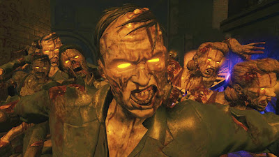

You can see from the image above that the zombies are re-used over and over, the two zombies to the right are the exact same design and the main zombie at the front and the far back to the left are also the same. This further justifies the re-use of models.

Maintenance/Efficiency: 
Maintenance is going back over the code that you have already created for that object. Something may need to be tweaked or deleted entirely from the code so that the object works either more efficiently or better. Sometimes, the code that you have created for an object may just not work and you need to make quite a few adjustments. Linking back with the simplified understanding, you may need to make some changes so the code is easier to read and understand purely for yourself or for team members. You can change the code you have created so it is more efficient. Having large chunks of code may lead to having a few bugs, and bug hunting in a large chunk of code is not easy. Using states usually tone down how much code you have contained in one chunk and makes it easier for you to understand.

Collaboration/Sharing:
Collaboration could be considered under two terms. The first term is collaborating with your team you are working with. You will need to collaborate with your team to produce something good. If you don't collaborate, not much would be done. The other term of collaboration is getting your code to collaborate with the objects correctly. If they do not collaborate with one another then you would need to go and alter the code so that it does collaborate with the object. Here is an example that I have found.

  1. The Program tells the GameController "Move North"
  2. The GameController tells the Player to "leave heading north"
  3. The Player tells its current location to "move me north"
  4. The Room asks each of its exits "do you head north?". If the exit responds "Yes"...
    1. Tell the Exit "Move this player"
    2. The Exit tells the Player "You are now in this room" using its destination Room

The example above shows the back and forth trips that the code takes and shows how they would collaborate with one another. If there were problems with the collaboration between the two sources then it would not work as efficiently or even work at all.
When working in a team, sharing out assets and/or code is essential. Making sure that the code is easy to understand, you would be able to effectively share your code amongst others in your team. This is why simplified understand is a must when it comes to sharing. Furthermore, you must be using the same versions of engine so that the code definitely works.

Quality Assurance: 
Quality assurance is paying attention to all of the stages of the process, models, codes etc, to a preferred quality. Every game has a certain standard that they must live up to, so quality assurance is checking up on all of the code and models, making sure they meet the desired requirements throughout the whole design process up until everything is complete.

Real-world Modelling:
Real world modelling is creating objects which resemble to something in the real world such as a chair, a table, a water bottle, a barrel, a door etc. However, when it comes to modelling objects to something in the real world, we then assume that we must code that object to work like how it would in the real world. So when it comes to a chair, you would want it to be able to be moved by simply walking into it, you would want it to react to bullets if you shoot it (leave a mark and move it) etc. Although, when it comes to game, you have the choice of whether you want it to follow the rules of how the real world objects would react. 

Game Objects:   

Sprites are 2D images which are usually pixel art of the character, objects, scenery etc. When it came to making a game in GameMaker, you would create sprites to create the design of your character/objects. If you wanted to animate your character or object you would have to create more sprites and then alter them slightly to make an effective animation that works really well. To make sure the animation works, you would code it so that it would flick through the image_index. You can also set a speed for this so you can decide on how quick or how slow the game flicks through the image_index.

Characters are the ones who you are most likely to get attached to within a game. Your player is a character, those who you interact with are characters and your enemies are also classed as characters (dependant on how important they are). Those who are given a name in the game are characters. Most characters have their own name, design, behaviour and animation. This will mean each main character would have their own coding. However, some of the code can be reused such as them colliding or being able to react to other objects. Some have used finite state machines to make sure the character isn't doing two things at once. For example, if you want a character to jump and then somewhere else in the code you can press another button to duck, you don't want them ducking and jumping at the same time. So the FSM only allows one state at a time.

Weapons are highly interact-able. A lot of weapons tend to have unique models, skins and some have very unique animations. A great game which has different weapon animations is Dark Souls 3. Dark souls 3 have a system which is called "Weapon Art". Weapon Art is a unique weapon animation/skill which is specifically for that weapon only. When the player uses two of the key buttons at the same time, and is above 0% stamina, they are able to perform this animation/attack. If the player attempted to use the weapon art with 0% stamina, it would not work fully. If the player triggers the weapon art with over 50% stamina then they would be able to fully use the weapon art attack however, it would take away a certain amount of percentage of stamina when it is used. The link below displays a weapon showcase of different weapons, what their move sets are and what weapon art they have.


                                      https://www.youtube.com/watch?v=IqHDs-0EmUs


Rewards within games are usually given when the player has done a certain something. A great example of this would be Black Ops 2 Zombies. If you complete a certain challenge within that zombie match, you would hear a noise and a symbol would pop up above your perks in the bottom left, this indicates the player that they have a "reward" waiting for them because they just completed something. Using sounds and simple visuals is a great way to alert the player that they have done something correctly and in the zombies, this was very effective. The way this may work with code is that, if the player completes, let's say, "101 headshots", it would have a keep a counter of how many times the object bullet has destroyed a zombies head hitbox. Once 101 has been achieved, it would trigger an event in which will play: sound and display a sprite in the HUD.
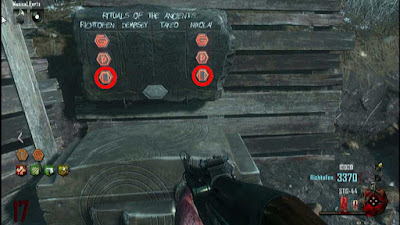

Rewards can also be given in permanent achievements which will stay on the platform that you have played the game on. They basically reward the player for them achieving something which is either quite difficult or for just simply for playing for so many hours and so on. They make the player strive towards putting in many more hours into the game and makes the player feel more valued for how many hours they have already put into the game. 

Instances:
Instances are made from objects and are given pre-defined variables (in GameMaker). They are virtually copies of objects that you can place in the room and you can choose where it is placed, change its variables, you can deactivate them, activate them etc. In my Shape Man game, I would de-activate the walls every so often so that more of the enemies can come out once they have spawned in. 


Object Properties: 

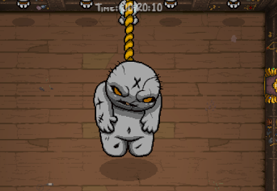
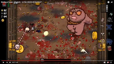
Object properties covers a large section of the design elements to the objects. This is the colour, size, movements, speed, sounds, health, lives etc. A good example of a few of these properties combined is a boss from the game "The Binding of Isaac: Afterbirth". "Greed" the boss from a Greed run is a great example of these object properties coming into play visually. The link below is a YouTube video that I have found which shows the boss eventually being defeated. You will notice as the fight goes on, the colour of the boss will slowly turn into a dark red colour, his movement becomes quicker and the movement of the boss is repetitive so the player can recognise what his next move is. What would happen here is, once the boss has dropped to 75% heath, his speed code is upped from 4 to possibly 5 and then when his health has dropped to 60% his speed would then raise to 6 and so on. As for the colour, it could possibly work in the same way. So when his health has reached a certain percentage then the sprite changes to a shade of red and gradually gets duller and duller.


                                   https://www.youtube.com/watch?v=4vakcS4USJA

As you can see from the images above, the start of the boss battle the boss is grey and then when the boss is really injured, he gains a red tone to his body. Furthermore, in the video, you can see that his stomps change in pace the more injured he becomes.

Rooms and Scenery: 

When it comes to making a room, you have a lot to consider; the size, what is placed in that room, the colour, the design etc. In GameMaker you can decide on the background colour, what instances are placed within the room, change the scale and change the speed of the room and more. When you have created a room, you can have multiple rooms and link them together with code. For example, if you have an instance which is called "Portal" then you can code that so once "player" has collided with "portal" then it goes to the next room, which would be whatever is after "Room0" or what you have named it. In Unreal Engine, you can create a landscape which is you can adjust the scale, section sizes, sections per component, number of components and overall resolution. Once this is created, you can then add some terrain to the flat landscape by using the sculpt tools. The scenery is placing objects to create a scene within the room/landscape. Animations and code can be assigned to the scenery. The scenery would be made up with either a bunch of different instances/objects or sculpting the landscape.

Bonuses and Power-ups:

Power ups and bonuses within games simply are there to make the game play a little easier and also to make the player feel more "powerful". When it comes to a power up, for it to work, there must be a timer in which it counts down from. For example, before I picked up a power-up i had 3 speed and have 50 health, once I collide with the power-up instance, I now have 5 speed and 100 health. From the point my values change, the counter will start to decrease, then once the counter reaches 0 it will change my stats back to the original stats which was 3 speed and 50 health. A good example of a power-up would be from the classic game of Pac-Man. In the video below, the player goes around and starts picking up little pellets, however when he eats one of the larger pellets in the corners, all of the enemies change to one colour and Pac-Man is able to eat them. Basically making Pac-Man invincible. He also receives bonus points from eating the enemies which adds on to his high score at the top of the screen. The score doubles each time he eats an enemy, first 200, then 400, then 800 and then finally 1600.
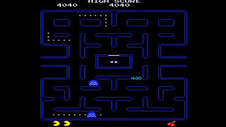

                                    https://www.youtube.com/watch?v=-CbyAk3Sn9I


Actions and Events: 

Create and Destroy:

The create and destroy system is fairly simple when thinking about it. A great example for the create and destroy events would be a shoot em' up game. When a player presses their trigger, it would activate an event which would "create" the bullet. The path can either go down one of the three routes. One route could be, if the bullet doesn't hit a player and hits an object then it would destroy. The second route could be, if the bullet hits the player/enemy, it would take away, lets say 10% health away, and then destroy itself. The last route could be if the bullet hits the player, it would take away 10% health AND if the player/enemy has 0% health after the previous 10% as been taken away then it would destroy itself and the other player/enemy.

Mouse and Keyboard:

Mouse and Keyboard events are events which are then triggered by either using the mouse or the keyboard. With the mouse triggered events, this could include simply hovering the mouse over a certain object or note, clicking on a certain object or simple clicking, holding and dragging an item to activate an event. With the keyboard, this could be as simply as pressing one key or multiple keys to trigger an event. Below are a few of the code names for mouse and keys. In a game such as surgeon simulator, the movement of the mouse and the AWER and SPACE keys on the keyboard are important. When the mouse moves to left then the object_hand (example) moves to the left and its the same with whichever direction the mouse is moved in. The keys come into play once you want to grab hold of something, you need to hold down the AWER and SPACE keys. Well the keys actually control individual fingers which makes the game harder. So if the player just holds down W and E only two finger would change to the grabbing animation and for however long they are held down, it would stay in that state. The other fingers would not move due to no other buttons are being held down. The link below is a video which shows the controls of surgeon simulator and how it works.
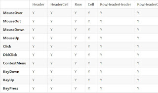
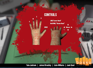


                                        https://www.youtube.com/watch?v=PBd5i52OvZ4

Timers: 

Time events are events which are triggered and then a countdown starts or a timer. Time events can be used for all sorts, could be to simply countdown a bomb, to something which is more in the background scheme of things such as counting down a timer until another enemy spawns in or another player can spawn in.   A great example of a time event (personally what I believe to be one of the best visual timer events) is from the game Crash Bandicoot Warped (3). Once you have completed that level, you can go back and see if you can beat that level within a certain time limit. To trigger the time events within this game is you hit the golden clock at the beginning of the level and then you race through the level as fast as you can. The best ranking relic is the platinum one and the lowest ranking relic is the blue one. These time events contribute to fully completing the game and interests the player into playing all of the levels in the game, over again. As soon as the character has touched the object_clock (for example) it has triggered the event of the timer where it counts up until the player has either lost all of his health or has reached the end of the level (this could be that the character model has triggered an invisible wall possible at the end of the level which then triggers for the timer to stop and display the time on the screen. Furthermore, if the player has reached the invisible wall or trigger in a time between 2:20 and 2:40 then the player is awarded with object_blue_relic (for example), if the player has reached the invisible wall or trigger in a time between 1:50 and 2:19 then the player is awarded with object_gold_relic and if the player has reached the invisible wall or trigger in a time lower than 1:49 then the player is awarded with object_platinum_relic.
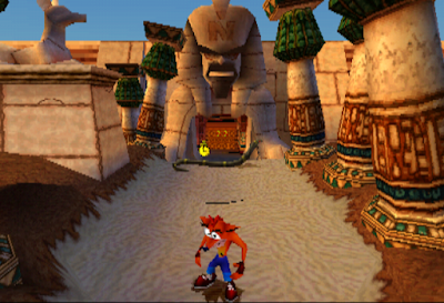


More Key/Button events:

The next generation Tomb Raider's contain quicktime events which rushes the player to press a sequence of buttons or a button to get out of certain situations quickly. These quick time events are events which just get the player to react quickly within the game. On PC this could be a sequence of different keys and on the Xbox/PlayStation this could be flicking the analogue stick back and forth or pressing the correct button. The coding for this section must have alternate paths it could follow. When the event has started, a timer starts to count down, within the time limit the player has to press the correct button, if the player does not press the correct button, this will then trigger an event and end that event altogether until it restarts. If the player does press the correct button then it will follow the blueprint to another event where it starts another timer and displays another button for the player to press and so on. Once all the correct the buttons have been pressed the event is ended.
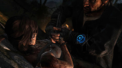
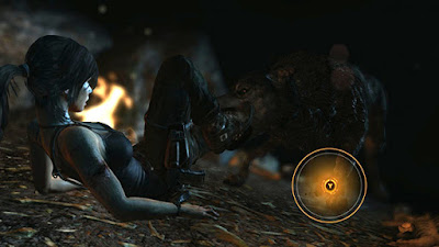


                                       https://www.youtube.com/watch?v=U0xcwWFsSGY

Scoring:

A scoring system is a great way at making a game competitive, some of the most popular games to this day have a simple scoring system which makes it simple objective to complete. However, keeping score within games is quite varied and some games use the typical points system as in, if you score a goal that is 1 point to that team. In a game like CoD: Zombies, it contains a different way of keeping score. The score that is kept is how many points that you have collected by killing zombies, re boarding windows and reviving people. Throughout the game, the points can be spent to get better weapons and such so that it is easier to play when the waves become harder. The points are all kept in a table which you can see whenever you like in the game. What also is kept is how many head shots, revives and downs everyone has. All the points are for the individuals themselves too. Each head shot is equivalent to 1 score added onto your head shots counters, same with the downs and revives. However, when it comes to the main source of you points, killing a zombie can range with the amount of points given to you. You gain more points from a head shot/melee than from just shooting the body of the zombie and it dies. This design is quite a clever design due to the playing needing points to progress through the level. The way this possibly works within the code is that if the the object "bullet" has hit the chest region then the player is awarded with +50 points let's say. If the object "bullet" has hit the hitbox for "head" then the player is awarded with +100 points and so on.

Collisions/Walls:

When a player interacts with objects in a game, they have different ways of being able to interact with them. A game which I personally have the most fun with colliding with objects in Dark Souls 3. The reason behind why I have chosen this game as an example for collision events is due to how many objects you can break with the player. Furthermore, another example for a collision event within Dark Souls 3 are the illusion walls in which the player must roll/hit.  The link below shows the player within the Dark Souls 3 hitting all of the walls with his sword. Around 8:50 minutes in, you see the player rolling into the objects and breaking them to (this links back to the collision side of things with certain objects). The images below are just two images that display where two of the illusory walls are placed within the game. The way this must work within the coding is that, as soon as a player action has hit the object, it would trigger an event such as removing the instance or activating an animation which shows the object being broken (dependant on the object!). That is a simple way of looking at how the design of the code may look like.
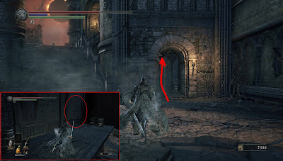
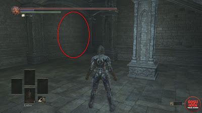


                                      https://www.youtube.com/watch?v=M7boShZeGiA

Other games may just contain simple collisions such as the playing being unable to walk through a wall, a rock, a table, a chair etc. When using the Unreal Engine, you are able to change the collision markings of an object, you could have complex ones or simple ones. Complex collisions are collision markings which try to line up perfectly with everything on your object. Below is an example of the collision for the model that I have made in maya and imported over to Unreal Engine.


Inheritance: 

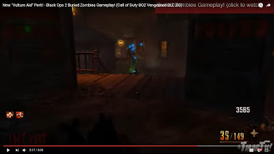
Inheritance is a great way to create variants of the same object. For example, a parent would contain the main source of code and child would carry over this code however you would add extras pieces of code to it. So, you could have a class and then sub classes. A game that I created used the inheritance tool on Game Maker. I created an object in which had the main source of code however I wanted to create more enemies but they all had something different about them. So all of the objects would fall down the screen, disappear when the bullet had interacted with it (hit it) and would destroy itself if it reached the bottom of the screen. However what made them different was what they would do, so some of the enemies would have a glow around them and some would shoot back whereas others just fell. A game which has a similar concept to this is CoD: zombies. A few of the zombies *when got the perk Vulture Aid* would have a green glow around them however they still behaved like the others zombies. What this green mist would do is just cover you in a smell if you sit in it and would allow the zombies to ignore you. Below is a video link and an image, around 2:10 mins, the video displays what I have discussed above in practise.
 

                                           https://www.youtube.com/watch?v=-dlewG2s1zk